

Pull down the Edit menu. You can change the following aspects of the graph:
Specifies that the values for each category on the graph are to be stacked. This is the default.
Release on the button to turn Stack off. The Performance Manager software displays a line mode graph to avoid occlusion. The values for each category are overlaid or unstacked.
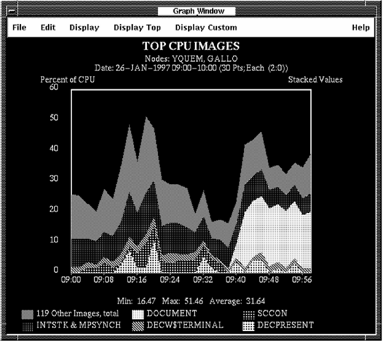
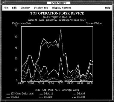
If you request an unstacked graph of top metrics, the items grouped together are displayed as an average instead of a total.
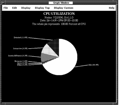
Specifies that the display is to be a pie chart. A pie chart produces a slice for each item, using size to depict average units of measure over the specified time period. When pie charts are displayed, stack and line mode toggle buttons do not affect the display.
For more information, see the chapter Generate Historical Graphs.
Specifies that shades of a single color shall be used to display the graph or pie chart.
Specifies that the values for each category on the graph are to be displayed in a line mode. Click the button to turn line mode off or on.
Release on the Editing Panel menu item and the Performance Manager interface displays a Graph Panel dialog box.
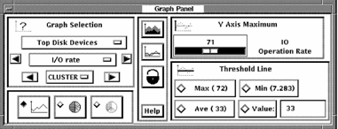
The Graph Panel dialog box contains five sections that allow you to enter any of the following:
The graph window is updated with the first graph in the list indicated by the major category. An exception to this is switching between the Top User and Top Image categories, which causes the same graph metric to be displayed.
The arrow buttons allow you to proceed through the categories in the specified class.
If multiple nodes have been selected for graphing, access to graphs by individual nodes is provided. Press MB1 on the CLUSTER menu entry to view the popup menu with all selected node names. Release MB1 on the node to be graphed. The arrow keys allow stepping through the node names sequentially.
Access to the System graph category is always available by node. To access the other graph categories, when the data was selected, the BY NODE toggle button must have been set.
The top toggle button flips the graph from line mode to fill mode, and back again. The pixmap on the button reverses to be the opposite of the state of the graph, allowing you to see where you can go.
The second toggle button changes the graph presentation from stacked to unstacked, and back again. A stacked graph displays the metrics one on top of another. An unstacked graph displays each metric value with respect to the X-axis. This can cause occlusion of some details, so it is best to view unstacked graphs in line mode.
The lock button will lock your current settings for stack/unstack, line/fill mode, Y-axis maximum, and threshold line selection. As you view different graphs, the same settings will be applied.
You can either drag the pointer across the scale or click either side of the value to adjust the scale. Press and hold MB1 to scroll the values.
The Y Axis Maximum value is maintained until the next data selection.
The Max, Min, and Ave lines are available only for stacked graphs.
Releasing MB1 on an option in the Change Color submenu causes Performance Manager to display a color mixing dialog box. The colors you establish are used when you save a color PostScript graph.
Releasing MB1 on a node name in the By Node submenu causes the current graph and all subsequent graphs to be drawn for that node only.
Note: If you did not select the By Selected Node processing option in the Data Selection dialog box, only system metrics graphs are available by node.
All Nodes-Releasing MB1 on All Nodes causes the current graph and all subsequent graphs to be redrawn for all nodes selected. When all nodes are selected the graph becomes a Composite graph. See the chapter Generate Graphs for more information on Composite graphs.
|
Copyright © 2008 CA.
All rights reserved.
|
|