

The Utilization (Calendar Chart) report maps the utilization percentage of the selected interface over time. Utilization is calculated on either inbound or outbound traffic, depending on the selected Presentation mode.
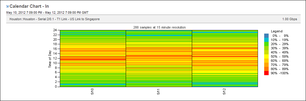
This view makes it easy to detect recurring data patterns. Finding a pattern can help you identify the source of high traffic rates and potential performance issues. You might discover that the high traffic rates you thought were intermittent actually follow a pattern. The view can show the hour of each day when utilization is the highest, for example.
Each color represents a severity range that is calculated as a percentage of total capacity. High utilization is shown in orange and red. Low utilization is shown in green and blue.
Follow these steps:
The report page is updated.
The reporting period is the most recent 24-hour period by default.
To see the utilization calendar chart for an interface in the Performance Center Console, add it to a custom dashboard or report page:
|
Copyright © 2014 CA.
All rights reserved.
|
|