

Designing the Graphical User Interface › Guidelines for Window and Dialog Box Design › Radio Buttons
Radio Buttons
A radio button is a control on a window or dialog box that offers the user one choice from a group of choices. It consists of a circle that is marked with a filled inner circle when the user selects it.
Radio buttons map to the permitted values of one attribute view. Only one button can be active at a time.
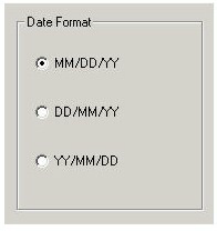
For example, the following illustration shows three choices for the date format. The user can select only one of the three. The format MM/DD/YY is selected.
The following list explains guidelines for radio buttons:
- Use radio buttons when there is a short list (up to about six) of possible values in a mandatory field.
- To avoid visual confusion, restrict the total number of radio buttons to six or less.
- You should have a minimum of two radio buttons.
- Align one to two radio buttons horizontally; align longer lists vertically.
- Follow the guidelines for field prompts.
- Use a group box around related radio buttons.
- Assign a mnemonic to the field prompt for each radio button to allow the use of the keyboard instead of the mouse.
More information:
Field Prompts
Mnemonics
Copyright © 2013 CA.
All rights reserved.
|
|