

Designing the Graphical User Interface › Guidelines for Window and Dialog Box Design › Push Buttons
Push Buttons
A push button is a control that performs an action immediately when it is selected. It is a rounded-corner rectangle with text or a bitmap inside.
Push buttons are used on dialog boxes, message boxes, and secondary windows that have no menu bars. Push buttons can also be used on a tool bar. For more information, see Tool Bars.
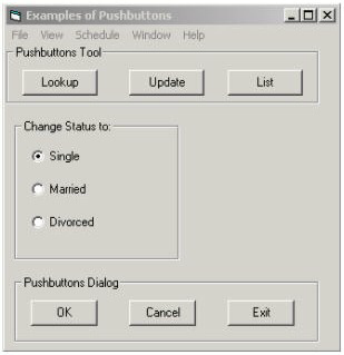
The following illustration shows the use of push buttons on a dialog box and a tool bar.
Selecting a push button results in one of the following actions for the user of the CA Gen application:
- Initiates a flow due to a command set that is an autoflow.
- Opens a supplemental dialog box to this procedure.
- Executes the procedure from the top.
- Executes an event.
- Executes a special action.
Examples of push buttons for dialog boxes are listed next:
- Apply-Causes the application to accept user changes in dialogs that set properties.
- Cancel-Closes the dialog box without performing uncommitted user changes.
- Exit-Closes the dialog box after the user has committed changes.
- Help-Displays online help.
- OK-Causes the application to accept any changed information.
- Reset-Cancels any uncommitted user changes and resets any changed fields to their initial values.
The following list discusses uses of push buttons:
- Exiting the dialog (OK, Select, Cancel, Exit)
- Invoking other functions or features (Options, Details, Help)
- Domain specific (does not apply to the whole dialog, for example, a prompt for a field; may invoke a list of values for that field)
The first two uses of push buttons are shortcuts for menu actions.
The third use of push button (domain specific) may not be provided as a menu item. This type of push button may be placed near the control to which it applies.
The following list discusses guidelines for push buttons:
- Provide a Cancel push button as required:
- Provide a Cancel (or equivalent) push button if the OK (or equivalent) button causes processing to take place.
- Do not provide a Cancel push button if the OK button is used to indicate that the reader has finished reading a purely informative message.
- Avoid yes/no and true/false text answers, as this will slow the user down by making them read the question.
By using a one-word description of the action to be performed, the user can make an immediate decision.
- If a push button invokes a secondary dialog, add ellipsis (...) to the text on the button to indicate that another dialog will appear.
- Position the push buttons with 10 pixel elements space between them and with the OK button in the bottom left corner of the dialog box.
- If a push button is not global to the dialog, place it near or within the group of related controls.
- Recommended placement for push buttons:
- If push buttons are aligned horizontally across the bottom, place affirmative actions to the left and non-affirmative to the right.
- If push buttons are aligned vertically down the right, place the affirmative actions above the non-affirmative actions.
- If feature and exiting buttons are all aligned either horizontally or vertically, separate the two uses by white space (a blank equivalent to the size of a button).
- Identify a default action by making the border of its push button bold.
- The default push button should be that which may be expected of the user to choose most often, when it will not delay the user or affect the state of the data if chosen accidentally. Most often this would be the affirmative action (why the user came here in the first place). The exceptions are actions such as delete, purge, archive, and sometimes print if it can cause a bottleneck. In these cases, the non-affirmative action should be the default as this is a form of confirmation by forcing the user to deliberately select the non-default button (as opposed to selecting the enter key without thinking of the result and accidentally invoking the wrong action).
- Push buttons automatically provide visual feedback when selected. They can be distinguished if desired by applying a bitmap image.
- If a push button is covered by a bitmap, its associated text cannot normally be seen. CA Gen enables the text associated with a push button bitmap to be displayed below the bitmap when the cursor is positioned over it for more than a few seconds. This is referred to as the micro help technique.
- Assign a mnemonic to each push button to let the user use the keyboard instead of the mouse.
More information:
Designing the Procedure Interaction
Designing the Procedure Logic
Special Actions for Menu Items and Push Buttons
Bitmaps
Visual Cues
Mnemonics
Copyright © 2013 CA.
All rights reserved.
|
|