

|
|
|
When a job reaches the historical maximum usage for a resource, the white bar and the rectangle outline next to that resource are even on the right side. As the job begins to exceed the maximum usage for a resource, the rectangle outline next to that resource shifts to the left to show the current maximum usage
The following figure shows a job that has exceeded the historical maximum usage for all resources:
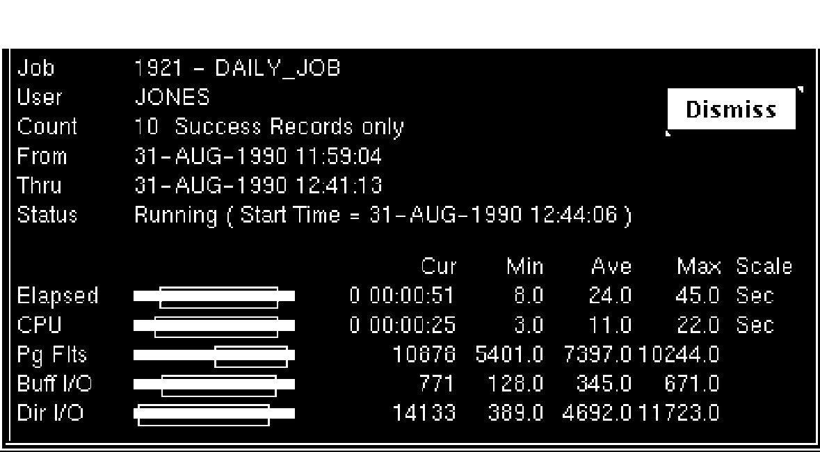
Note how far the rectangles have shifted to the left. This distance allows you to compare the current usage (indicated by the white or colored bar), with the historical maximum usage (indicated by the rectangle outline).
| Copyright © 2012 CA. All rights reserved. | Tell Technical Publications how we can improve this information |