

Executive: William
William logs in to CA Clarity PPM and goes to the Resource dashboard. William sees the interactive portlet displaying visual information. Bars on the graph show the FTE developer role demand by month. The blue horizontal line shows the capacity for that role. The FTE percent increase/decrease is currently set at zero percent.
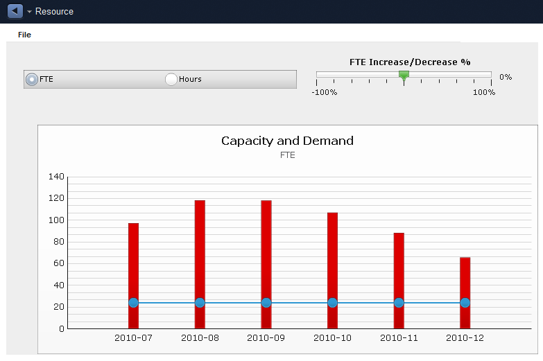
Based on the information displayed in the Capacity and Demand graph, William can see that the role demand per month exceeds the role capacity. Using the gauge, William performs a what-if scenario by increasing the FTE percent to see if resolves the staffing issue. Based on the analysis, William contacts the project manager and recommends hiring five developers and reassigning five developers from nonstrategic projects.
|
Copyright © 2015 CA Technologies.
All rights reserved.
|
|