

How You Graph Seven or More CPUs › Step 5: Create the Graph in Excel
Step 5: Create the Graph in Excel
To create the graph in Excel
- Open the .CSV file in Excel.
- Select the data beginning with cell A6 through the lower right cell you want to graph.
- Click the Chart Wizard
OR
From the Worksheet Menu Bar, click Insert, Chart.
- Select Chart Type Column with chart sub-type from row three, left sub-type 3-D Column, and then click Next.
- Select Columns and then click Next.
- Enter the title Processor Busy.
- Set the X-axis as Time, the Y-axis as CPU, and the Z-axis as % Processor Total Busy, and then click Next.
- In Step 4 of the wizard, click As a new sheet for the chart location, and then click Finish.
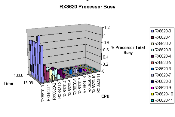
The chart appears on a new sheet in the current Excel file, as shown in this example:
- To adjust the chart, right click in the chart and choose an option from the pop-up menu.
Tips for viewing your data in the Excel Chart:
- Use the 3-D View to rotate the chart.
- If the collection intervals are all on a single day, you can choose to omit Column A from your graph selection. Add the date to the worksheet title for the chart, or to the Chart Title.
Copyright © 2008 CA.
All rights reserved.
|
|