

The stacked trend plots for Protocol and ToS summary data are excellent for establishing the types of applications that use the most bandwidth for a particular interface. Stacked trend plots also help you compare the use of each application with others.
The legend on the right of the stacked trend chart lists the protocols or ToS values so you can see the amount of data that is transferred for each category. In the example, notice the surge of inbound web (http) traffic.
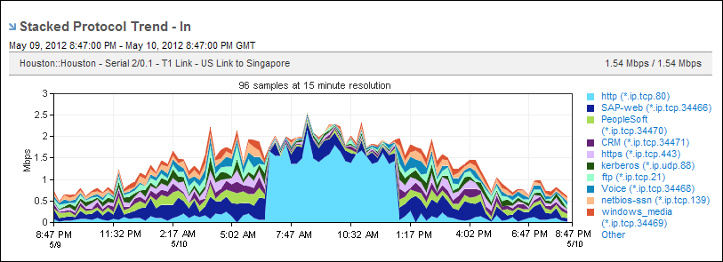
The example report duration is daily. You might want to change the duration to monthly to determine whether the surge is a one‑time occurrence or occurs regularly at a particular time. By default, views and reports show the most recent 24 hours of data. To change the time period or apply a time filter, use the Timeframe options.
|
Copyright © 2013 CA.
All rights reserved.
|
|