

The Utilization (Calendar Chart) report provides information about the inbound or outbound utilization for the selected interface by mapping the utilization percentage on a calendar chart.
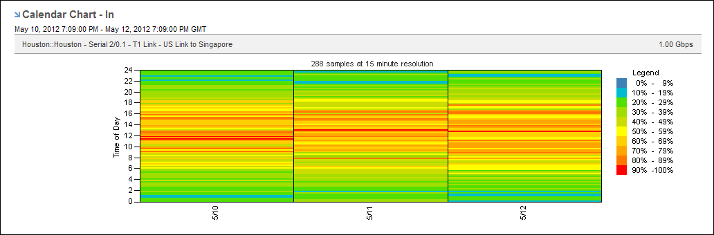
Excessive utilization of an interface is shown as a block of red that extends across the column for the day and across the rows for the time of day. Low utilization is shown in green. Varying shades of each color indicate the severity. Each severity range color corresponds to a range of utilization values, which are calculated as percentages of total capacity. The legend shows how the colors are used in the utilization calendar chart.
To display a Utilization report, start from an interface report.
Follow these steps:
The report page is updated to show utilization data as a calendar chart.
The currently selected option is highlighted and is marked with a blue arrow.
The reporting period is the most recent 24-hour period by default.
|
Copyright © 2013 CA.
All rights reserved.
|
|