

Use the Operations page to explore and troubleshoot performance problems. A performance map bubbles up the worst-performing network, server, and applications to the top of the page. As you click these items, the report focus narrows.
Typically, end users report the following performance problems to operations centers and Support teams:
The performance maps collect the following data about performance issues:
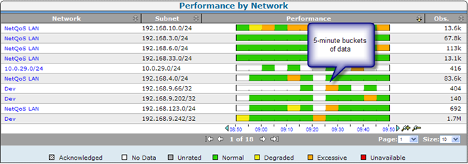
The Operations page shows performance maps by network, server, or application as a horizontal, color-coded bar chart that compares overall performance elements against defined thresholds. The color coding corresponds to a data rating.
Increments on the performance bar represent the average value for a five-minute period.
|
Copyright © 2015 CA Technologies.
All rights reserved.
|
|