

The Performance Maps display in the Engineering page. The format is a horizontal bar chart comparing various elements -- Total Transaction Time per configured application sorted by the longest times (slowest applications) on top, Network Round Trip Time per configured network sorted by the longest times (slowest networks) on top, and Server Response Time per configured server sorted by the longest response times (slowest servers) on top.
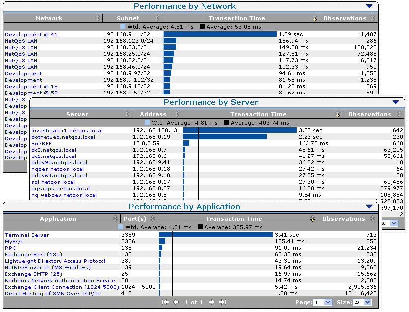
You can Isolate the component time contributing to a performance problem by clicking one of the items listed on the view. The page refreshes and additional information focused on your selection displays.
The following example shows the Response Time Composition: Average view:
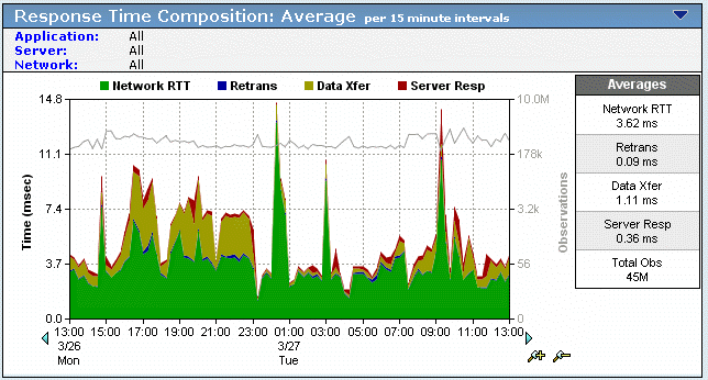
The components of the Response Time Composition: Average view are stacked beneath it, as partially shown in the following image:
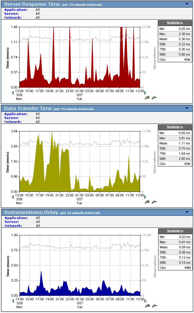
When viewing the stacked component view, the component with the most color overall or in any spike is the main contributor to the slow performance of the application at that time.
Identify the component contributing the most latency to the overall application performance, and then scroll down to the individual component view to begin investigating the extent of the performance issue.
Investigate the extent of the performance issue by following these general guidelines:
|
Copyright © 2015 CA Technologies.
All rights reserved.
|
|