

This topic presents basic examples of each form element type.
|
Item: |
Description: |
|---|---|
|
|
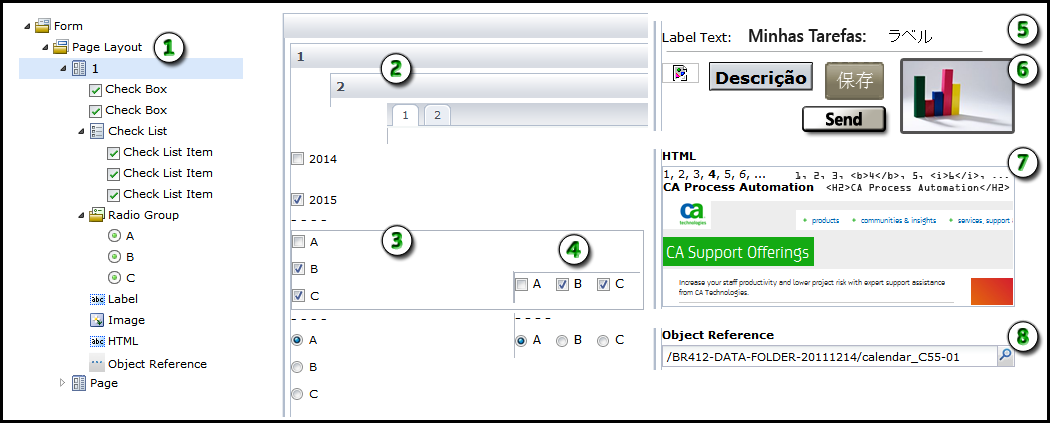
Form Structure: While you design the form, the bottom of the Form tab displays the arrangement of pages and form elements. |
|
|
Page Layout: You can set the layout to display pages as cards or tabs. Cards appear in sequence when the user clicks Back or Next. Tabs let the user select any tab to view the associated page. |
|
|
Check Boxes and Radio Buttons: Use a group of check boxes (check list items) when a user can select multiple related items. Use a group of radio buttons (option buttons) when a user can select only one related item. Use individual check boxes to control settings for unrelated items. |
|
|
Orientation: You can set check list and radio group orientation to vertical or horizontal. |
|
|
Labels: Use labels to identify specific fields or regions in the form. |
|
|
Images: Use an image element to include a graphic. An image can display a logo, icon, status indicator, or button that users can click. When the form cannot locate an image, the product displays a broken link icon. |
|
|
HTML: Use the HTML element to specify HTML code to render for the user. |
|
|
Object Reference: Use an object reference to give users an easy way to select another object in the library browser. An object reference stores the path to an object in a library. For example, a user can specify a touchpoint on an Orchestrator and then run a process on the selected touchpoint. As the designer of the form, you can limit the available types of objects that an object reference allows. |
|
Item: |
Description: |
|---|---|
|
|
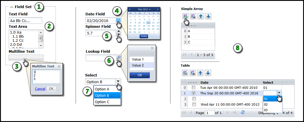
Field Set: Use field sets to group related form elements. Users can expand and collapse field sets to focus on specific parts of a form, thereby avoiding clutter. |
|
|
Text Field and Text Area: Use text fields to let users enter basic data such as names, addresses, email accounts, telephone numbers, and other details. Use text areas to let users enter multiple lines of text. Users can view the amount of text that you set in the height property on the form and scroll the remainder of the field. |
|
|
Multiline Text: Use multiline text to display large amounts of text in a separate resizeable scrolling window. This element occupies a single line on the form. The form displays the element as a button with ellipsis (...) to indicate that the user can click to browse the full window. |
|
|
Date Field: Use a date field to store a date. Users can enter a date or select a date from the integrated calendar control. |
|
|
Spinner: Use a spinner to let the user adjust a value up or down in predefined increments. |
|
|
Lookup: Use a lookup element to display a one-column table of values in a popup window. You can use a dataset or external data source to provide the values. A user can click a value and then click OK to both populate the lookup field and store the value. |
|
|
Select: Use a select element to display a drop-down list of options. |
|
|
Simple Array and Table: Use a simple array to store a single type of data in a table. Use a table to store multiple columns of data. These form elements include options for adding, deleting, and moving rows. |
You can insert the following elements in a table:
|
Copyright © 2014 CA.
All rights reserved.
|
|