

The Anomaly Activity view displays anomalous activity as a bar chart. This view gives you a visual overview of how many anomalies and anomaly clusters occurred in comparison to all of the records that were processed.
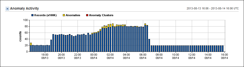
The example graphic shows the number of records in the hundreds of thousands (Y-Axis) over a 24-hour period. Activity is shown along the X-Axis each time the program runs (usually at 15-minute intervals).
You can edit the following view settings:
By changing the time frame for the page, you can discover when the issue began and look for patterns.
This view is included by default on the Anomaly Detector page in the Performance Center Console. The example graphic shows the view as it appears in the CA NetQoS Performance Center Console.
|
Copyright © 2015 CA Technologies.
All rights reserved.
|
|