

When you choose to view Utilization summary data for an interface, the data is displayed as a calendar chart. You can show inbound, outbound, or total traffic in the chart, choose the month to display, and apply any available time filters.
Excessive utilization of an interface is shown as a block of red extending across the column for the day and rows indicating the time of day. Low utilization is shown in green. Varying shades of each color show the severity degree. The color for each severity range corresponds to a range of utilization values (calculated as percentages of total capacity). The legend explains how the colors are used in the calendar chart.
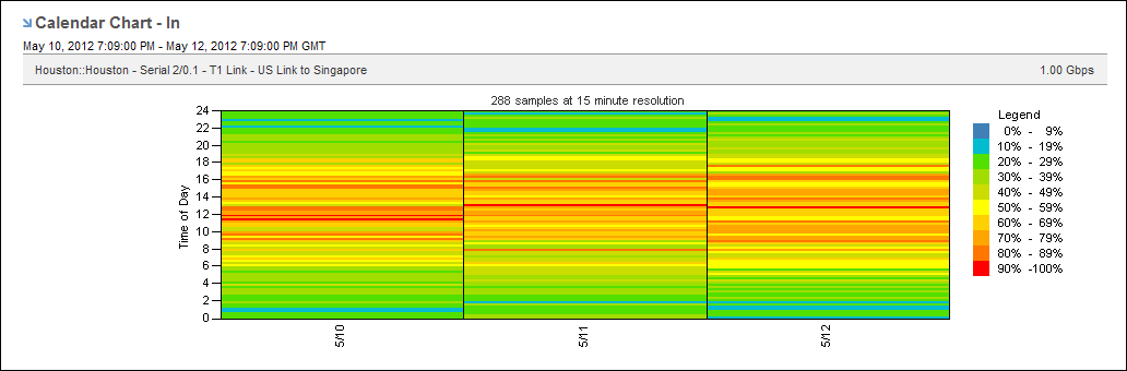
The calendar chart helps you detect utilization problems with the selected interface, determine when the problem started, and pinpoint the time of day the problem occurs. In the example, the interface utilization level is often at or above 70 percent. The high utilization level means that the performance of the applications sending data over this link is likely to be degraded at those times. Calendar charts can also reveal patterns from day to day and week to week so that you can determine whether a problem occurs regularly at a particular time.
|
Copyright © 2013 CA.
All rights reserved.
|
|