

When a Q&R query includes one or more data extract steps, each data extract step generates a Comma Separated Value (CSV) file. The CSV file is sent to the distributed server, and is available for charting. The charts are generated at the granularity specified by the data extract key selections.
For any given chart, there is a limit to the amount of information that can be usefully displayed. The Query Views feature helps to maximize the information value that is associated with a data extract CSV. Using multiple views, you can see different charts for each chart instance that meets the summarization granularity for the data extract CSV.
For example, if the data extract summarization keys result in a chart for each unique LPAR (SYSID), each chart in the initial chart view might display the amount of CPU time that the LPAR uses. A second chart view could show the LPARs memory use, and a third might show the I/O service units that the LPAR consumes.
Creating multiple views for a single data extract provides a powerful data analysis tool, ideal for exploiting the metric rich files in the CA MICS database. Many CA MICS files contain hundreds of data elements. By adding a large number of data elements to a data extract, using the data extract Element Selection task, a series of chart views can be designed that display information to help understand the root cause of resource usage spikes and other anomalous behavior.
As an example of the value that is provided by multiple query views, consider the RMF component WLM Service Class query:
RMFSRV – z/OS Service Class Analysis by SYSPLEX, CPCID, and SYSID
This query generates three output CSVs. Each output CSV has four Q&R views defined that let you analyze different aspects of each WLM Service Class Period participating in a SYSPLEX. The primary purpose of this query is to allow you to see how well your Service Classes are performing against their goal objectives. This information is provided with the initial chart view. If you find a Service Class Period (SCP) where the WLM Performance Index (PI) value indicates that the goal was not achieved,you can examine one or more of the additional query views to help understand the reasons behind it. These additional query views provide summary information about the sampled states for the SCP, and a breakdown of the various execution delays experienced by workloads belonging to the SCP. Understanding the types of delays that impeded the workloads can help you understand the reason why the goal was not met, and provide information that you can use to resolve the problem.
The RMFSRV query includes three data extract steps that generates the following output CSVs:
To show how multiple chart views support sophisticated problem analysis, we will examine the charts views for the data extract. Service Class by SYSPLEX. From the CSV file associated with this data extract, Q&R renders charts for each SCP in each SYSPLEX. At the SYSPLEX level, the SCP performance information is aggregated across all z/OS LPARs and Central Processing Complexes (CPCs) participating in each SYSPLEX. The following chart views are provided for the data extract:
Note: The other two data extracts, Service Class by SYSPLEX CPCUID and Service Class by SYSPLEX CPCUID SYSID, provide similar chart views.
When multiple chart views are provided for a Q&R query, the first view is automatically displayed by Q&R when the data extract is charted. Following is a chart sample for the query RMFSRV View #1: WLMCLASS by SYSPLEX – CPU and PI.
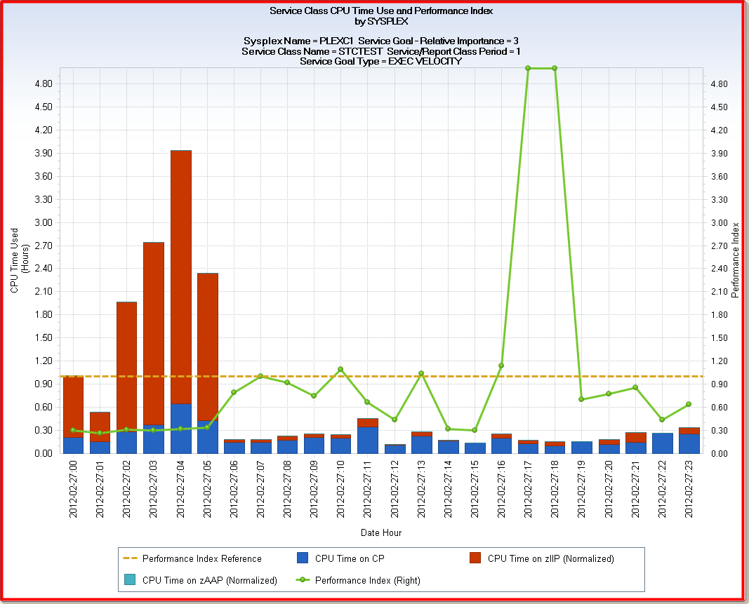
Here you see the HOURLY chart for Period 1 of Service Class STCTEST, for February 27th 2012. The SYSPLEX name is PLEXC1. The SCP has a relative importance of 3 and an EXECUTION VELOCITY goal type.
As you can see, workloads running in this SCP execute on a mixture of CP and zIIP processors .The zIIP processors were heavily used in the early morning hours, but from about 6 AM until midnight, the CPU usage occurred primarily on CP processors—at the rate of about 0.20 CPU hours per hour. The Performance Index spikes well above a value of one between 4 PM and 7 PM. This means that the SCP goal was not met during those hours. To determine why the goal was not met, you can examine the other views that are provided by the query, using the VIEW drop-down button on the Q&R charting window.
Selecting View #2, WLMCLASS by SYSPLEX – Sampling Summary, results in the following new chart display for the same SCP:
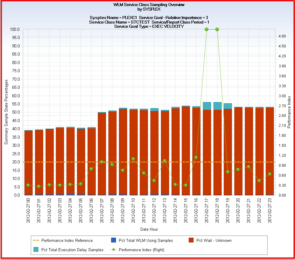
IBM’s Workload Manager (WLM) samples SCP workloads to determine their execution status. This Sampling Summary view displays the percentage of the samples that were found to be in one of three states: Using, Wait-Unknown, and Execution Delays. A fourth state not shown, which if added to the chart would bring the stacked bars up to the 100 percent line, is the percentage of samples where workloads in the SCP were idle.
The dark blue bar segments at the bottom of each stacked bar represent the percentage of samples where the workloads were using the CPU and, if I/O Priority is active, performing I/O. The red bar segments represent the percentage of workload delay states that WLM does not manage. These delays include time waiting on an I/O, DB2 latches, tape mount, enqueues, and others. The cyan colored bar segments represent the percentage of samples where the SCP workloads experienced execution delays for resources that WLM does manage. You can see that for the hours between 4 PM and 7 PM, where the SCP goal was not met (PI > 1), the percentage of Execution Delays increased.
To determine the types of WLM managed execution delays experienced by the SCP workloads, you can examine views #3 and #4, Exec Delay States Group 1, and Exec Delay States Group 2, respectively. Two separate chart views are provided because there are almost 30 specific types of execution delays—too many to display effectively in a single chart.
Selecting View #3, Exec Delay States Group 1, results in the following chart display:
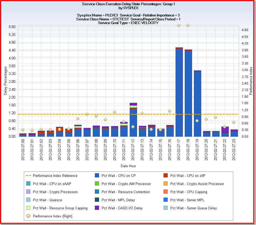
As you can see, there is a large spike in the Pct Wait – CPU on CP execution delay type for the hours between 4 PM and 7 PM when the execution velocity goal was missed. You now know the reason why this SCP failed to meet its execution velocity goal objective during those hours. About four percent of the time when the SCP workloads were ready to execute, they were waiting to be dispatched on CP processors—most likely because workloads belonging to higher priority Service Classes were competing for the same CP processors.
Selecting View #4, Exec Delay States Group 2, results in the following chart that shows the percentages of samples encountered for each of the remaining WLM managed execution delay wait states:
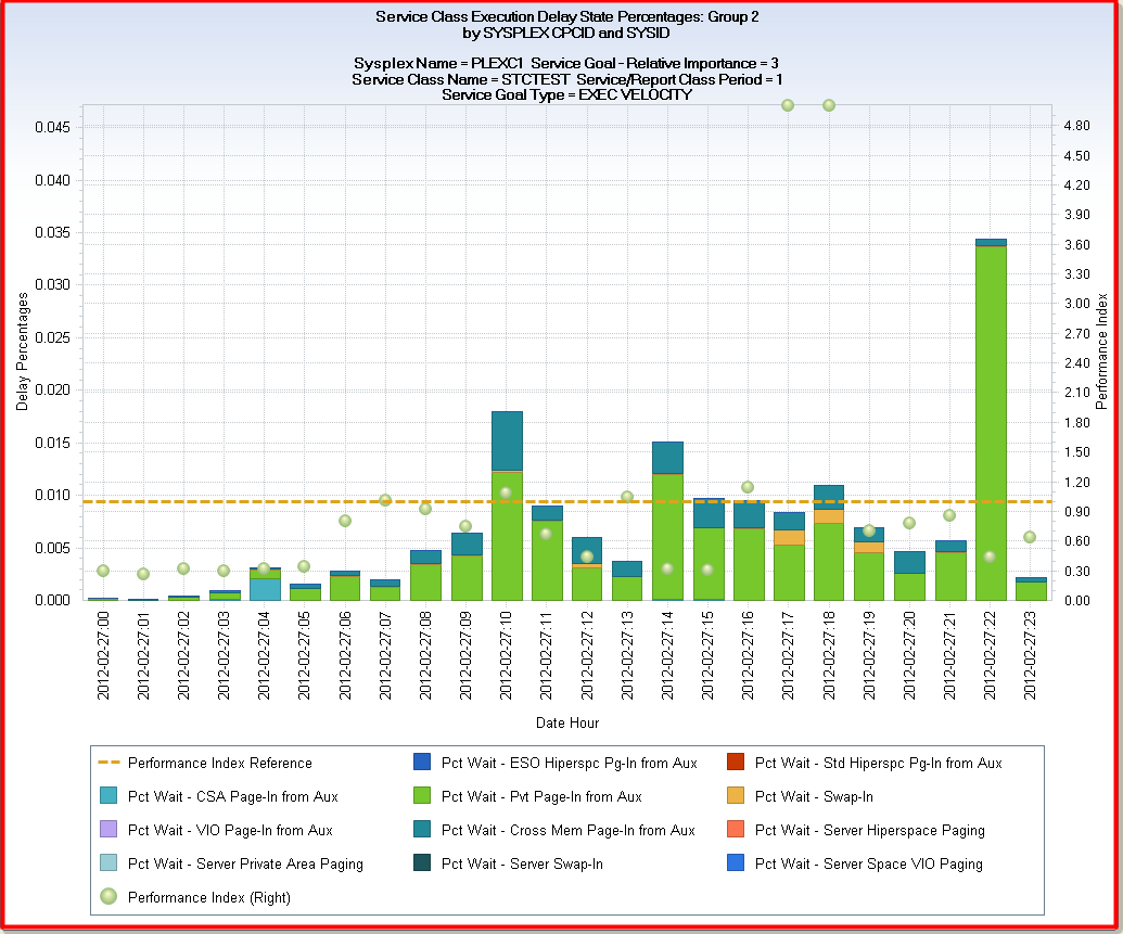
Make sure to examine the Left Y axis scale for these last two views, where the scale adjusts dynamically to match the values encountered in the charted data. The Left Y axis in the Group 1 view above ranges from about 0-5%, but only ranges 0-0.045% (less than 1/10th of 1 percent) for the 4th view.
With this example, you can see how the Q&R View feature can be used to create multiple chart views from a single data extract, allowing you to display different metrics from the same CSV file, simplifying sophisticated problem detection and analysis.
|
Copyright © 2014 CA.
All rights reserved.
|
|