
iConsole User Guide › Dashboards › About Dashboards
About Dashboards
The iConsole dashboard shows charts and metrics of incidents and violations, broken down by policy, channel or impact. Data is shown in separate panes which you can configure and rearrange to focus on the areas of most interest.
You can also drill down into a pane to view a list of the underlying events or, for pie charts, a further chart showing a breakdown of the data in an individual pie slice. Likewise, in a 'table' pane you can click individual cell values to view the underlying incidents.
Note: Dashboard charts and metrics are based on aggregated data.

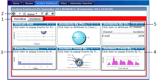
Example dashboard layout
- Page tabs: Click to switch between dashboard pages.
- Dashboard configuration buttons: Use these buttons, for example, to update the dashboard to use the latest available data, or to reset it to its original layout, or to change the dates.
- Metrics pane: These summarize the number of blockings and warning, reviewed and unreviewed incidents, and escalated incidents, for the current time period. Click any metric to drill down and see the underlying individual incidents.
- Chart pane: The dashboard supports all common chart types, including pie charts and bubble charts. This example shows an area chart. Use the pane options (4) to configure the chart.
Hover over a data point to see summary details. Click any data point to drill down to see the underlying data.
- Pane options: Use these buttons to resize the pane and set the chart options (type, legend, axis labels, and so on).
Copyright © 2014 CA.
All rights reserved.
 
|
|


