

The Investigator lets you view column data in a pie chart. These charts provide a visual, customizable means of evaluating your data.
Follow these steps:
Initiates the SQL function to display the number of rows that matches the specified criteria. This format is the aggregation default.
Initiates the SQL function to display the total sum of the numeric columns.
Initiates the SQL function to display the average value of a numeric column.
The customized pie chart appears in the center pane. If necessary, scroll down to see the table view.
Note: If the number of slices is more than 10, the chart groups the rest of the slices under a slice named Others. The chart groups all columns having null values under a slice named NULL. The chart groups all columns having empty spaces as a value under a slice named EMPTY.
Example Pie Chart: Connected Systems
The example chart is based on a table that contains a column named System. This column identifies the systems to which CA Chorus is connected. System1 to System7 are the values that are listed under this column. CA Chorus has one connection to each system. If you select System as the field to group your data while charting column data, the following pie chart appears:
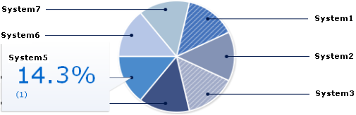
To see the label and percent of the column value, hover over the slices. For example, if you hover over the slice that represents System5, the callout in the figure appears.
Example Pie Chart: Aggregating Data
This example shows how to use data aggregation. Assume that a bank has two types of accounts: checking and savings. Each account has a dollar balance. This list shows the various options based on the same group by value. Each pie has two slices—one for checking and one for savings.
Note: The following italicized values are intentionally generic to illustrate the usage for all disciplines.
Shows a pie chart where the size of the slice corresponds to the number of accounts in the type.
Shows a pie chart where the size of the slice corresponds to the total dollar value of the accounts in the type.
Shows a pie chart where the size of the slice corresponds to the average size of the accounts in the account type.
|
Copyright © 2015 CA Technologies.
All rights reserved.
|
|