

|
|
|
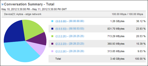
Pie charts provide a visual comparison of the protocols, ToS, hosts, or conversations on the interface, making it easy to see which ones use the most or least amount of bandwidth. Pie charts also include a listing of numeric data.
By default, views and reports show the most recent 24 hours of data. To change the time period or apply a time filter, use the Timeframe options.
| Copyright © 2012 CA. All rights reserved. | Tell Technical Publications how we can improve this information |