You can compare two scenarios either side by side or top to bottom, including all the investments and their various metrics in a grid or graphical format. You can compare two different portlets of the same type representing two scenarios. This allows you to plan your portfolios more efficiently by looking at two different scenarios at the same time and determining which one is the best one.
For grid portlets, you can compare two scenarios in a single portlet using red-lining to compare the values in the two scenarios.
On the Scorecard and Analyze tabs (where you can compare scenarios), after selecting a value from a drop-down on the page’s toolbar, you must click Filter.
To compare two different portfolio scenarios side-by-side
The Portfolios page appears.
If the page is in maximized view, only the Investments portlet appears by default. From the drop-down menu that appears on this portlet’s toolbar, select a different portlet to view.
Compare Scenario Example
You, as the portfolio manager, log in to CA Clarity PPM and open a portfolio. Your goal is to find out how best you can achieve the development release goals and the customer commitment for certain features. To do this, you create two portfolio scenarios:
Scenario 1 has a budget of $1,000,000. In the scenario you select all projects related to the next release and all projects related to all customer enhancement requests and you notice that you will need close to $2,000,000 to complete both sets of projects. This leads you to create another scenario.
Scenario 2 pins only those projects related to core code development, does not select other projects related to hosting new code for sales and marketing departments. You also pin the projects related to key customers. After generating the scenario, you notice that within the budget cost you can accommodate some more projects related to development or customer. You are still not sure and would like to compare both scenarios.
For both scenarios, you want to make sure that you plan for projects that are not at risk and have a good alignment with the company’s goals for the current year. To do this, you compare the two scenarios. You select Scenario 1 from the Scenario drop-down and Scenario 2 from the Compare Scenario drop-down on the Scorecard toolbar. Both portlets display side by side as a default.
You notice on the Investments portlet that two of the customer projects are at higher risk than the development projects. You believe that the projects are at risk because the requirements are not clear enough. You feel that these projects should not be rushed and need more research before development of the customer related projects begin. You are able to push the customer related projects out to the last 3 months of your portfolio and thereby pull in more core code development projects.
When performing a side-by-side comparison of two scenarios, the following lists the expected behavior on pages and portlets:
The graph portlets show two graphs (that is, two portlet instances) representing two scenarios side by side. If you do not select a Compare Scenario, then only one portlet is displayed.
The grid portlets show a row for each investment with stacked values for some attributes, representing variances in the two scenarios. Red-lining appears to allow you to distinguish the attribute values for the two scenarios. Other than time scaled values, all attributes with a "(Compare To)" suffix display red-lining for scenario comparison. If you do not select a Compare Scenario, then stacked rows and red-lining does not appear.
Personalizations only apply to each instance of a portlet on the page. For example, if you personalize one pie chart in a side-by-side layout of two pie charts, only the personalized one changes. Customizations made at the administrative level apply to both pie charts because there is only one "type" of chart although it appears multiple times on the same page.
The Compare To scenario (right) list is dynamically built based on the value you select in the Scenario (left) list.
Only values that are eligible for editing while in the scenario are editable. This rule applies to the left scenario only. The right scenario is never editable when comparing two scenarios.
Filtering only applies to the left scenario data (for example, you can show only approved investments or hard booked team members).
The values on a page default to the "plan of record" when you do not have a scenario selected.
For grid portlets, the left scenario data displays on the bottom line whenever the two selections have differing values. If data is the same, only one value appears.
For grid portlets, the right scenario data displays on the top line and is red-lined whenever the two selections have differing values. If data is the same, only one value appears.
When you navigate between portfolio scenario-enabled pages, the selected portfolio scenarios persist – that is, the portfolio scenario selections apply application-wide and appear on all portfolio scenario-enabled pages. A portfolio scenario-enabled page is one from where you can create or select a portfolio scenario using the Portfolio toolbar.
A special value [-- None --] allows you to display only the left scenario data without comparing it against any other scenario or the plan of record. This value is only available in the right scenario list.
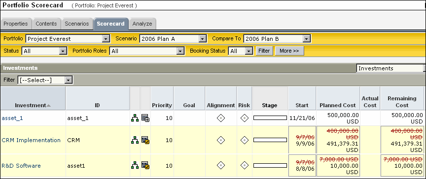
The Investments portlet Portfolio Scorecard page compares the two scenarios using stacked rows and red-lining. The scenario data that you selected from the Scenario drop-down appears on the bottom row. The scenario that you selected from the Compare To drop-down appears on the top row (with a red line if it differs from the bottom row).
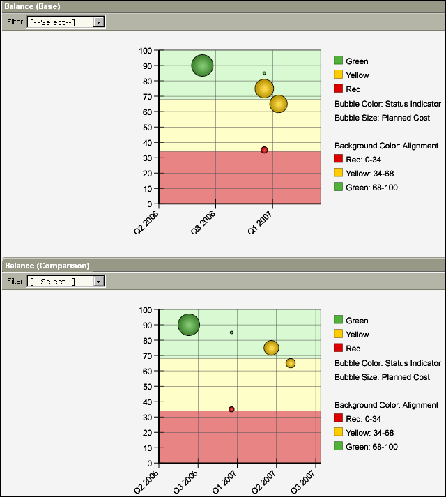
The Balance portlet on the Portfolio Scorecard page compares the data in the two scenarios by displaying two different bubble graphs. The Base bubble graph on the top represents the scenario you selected from the Scenario drop-down. The Comparison bubble graph on the bottom represents the scenario you selected from the Compare To drop-down.
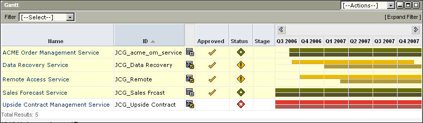
The Portfolio Scorecard page compares the data in the two scenarios using a primary bar and a secondary bar. The primary bar at the bottom represents the base scenario and the secondary bar at the top represents the comparison scenario.
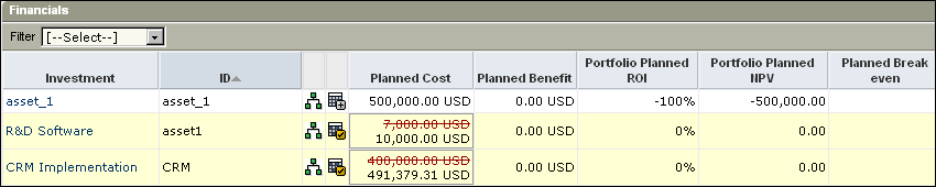
The Financials portlet on the Portfolio Scorecard page compares the data in the two scenarios using stacked rows and red-lining (as in the case of the Investments portlet).
| Copyright © 2010 CA. All rights reserved. | Email CA Technologies about this topic |