

|
|
|
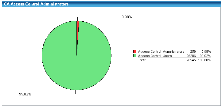
The reports output uses tables, and graphics when appropriate. For example, some reports include a pie chart to convey meaning at a glance while still providing supporting details. As shown in the figure below, the CA Access Control Administrators report provides a pie chart of how many endpoint users are CA Access Control administrators. A high ratio of administrators to normal users may pose as security risk, so the graphic quickly shows if there is a security exposure. In this example, a large red wedge in the chart is significant because it shows that almost 1% of the current enterprise user base can perform CA Access Control administration.
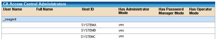
In addition to the graphic, each report has an associated listing of the actual endpoint values. Following is a sample of this table of the CA Access Control Administrators report:
| Copyright © 2012 CA. All rights reserved. | Tell Technical Publications how we can improve this information |